
Shopify product photos with one look
Every product in the same light, from phone snapshots.


Three products, one collection
Tote Planter Cushion 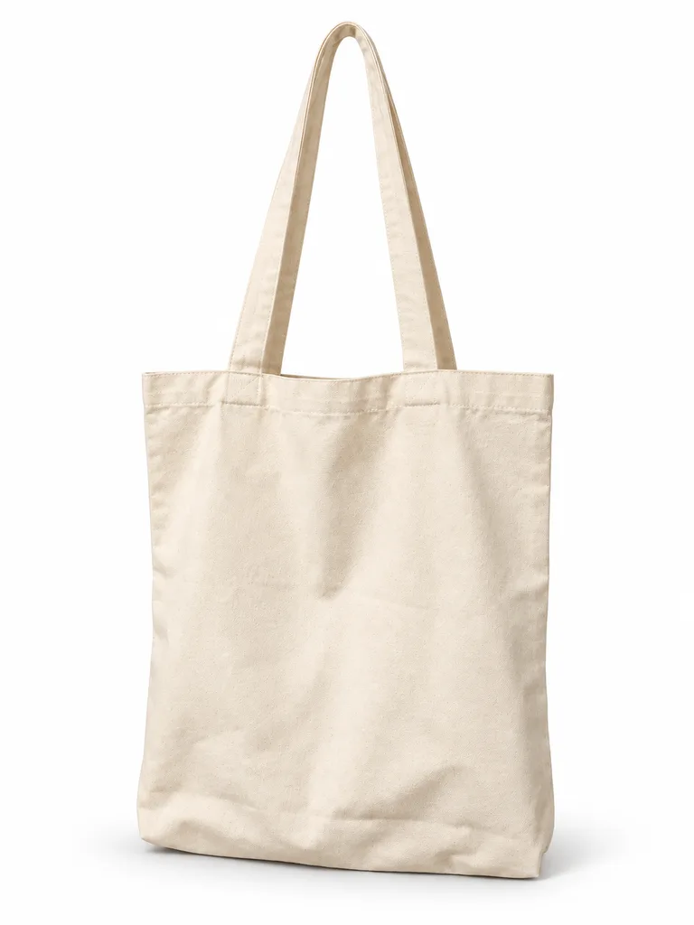
Tote on white 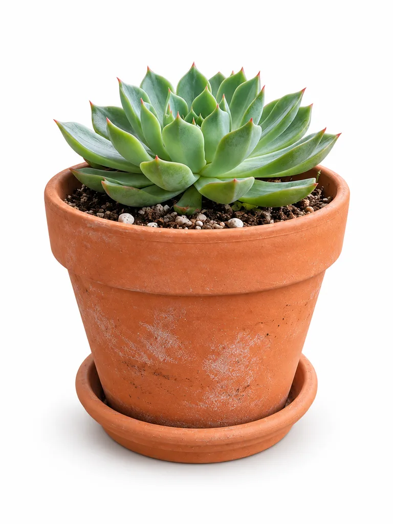
Planter on white 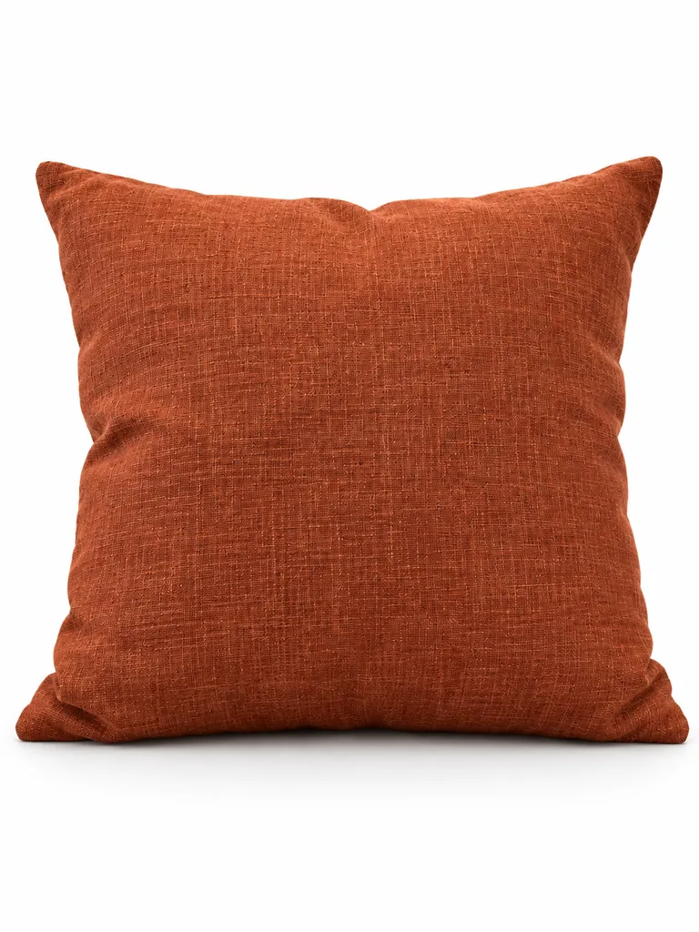
Cushion on white


About these shots
- Tote
- Same scene, same light direction as its neighbors.
- Planter
- Shot on a balcony, now matching the tote.
- Cushion
- Different room, same set.
- Tote on white
- The white version for the product grid.
- Planter on white
- Same 3:4 frame as every other product.
- Cushion on white
- White first, scene on hover or as image two.
The before photos on this page are generated stand-ins for a seller’s phone snapshot. Each result is the named Sweepshot scene applied to that snapshot, with no retouching afterwards.
What makes a Shopify grid look planned
- One ratioFor every product
- 2,048 pxSquare images
- Alt textOn every image
DetailsChecked 27 October 2026
| Setting | Do this | Why |
|---|---|---|
| Aspect ratio | Same for every featured image | Shopify recommends a consistent ratio so products show at the same size in collections. |
| Size | 2,048 × 2,048 px for square images | Shopify’s own suggestion; it accepts up to 5,000 × 5,000 px and 20 MB. |
| Background | One background per collection | White for the grid, one scene for the second image. |
| Alt text | Describe the product and its color | Shown to screen readers and used by search engines; set it in the product’s media. |
| Variant images | One photo per color | Shoppers see the right color when they pick a variant. |
Checked on 27 October 2026 against Shopify Help Center: Product media types. Marketplaces change their rules; check your category before you publish.
Shopify guides and tools
Scenes for a store
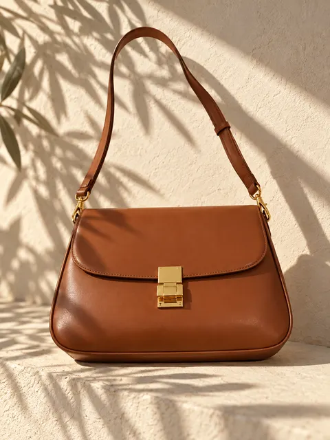
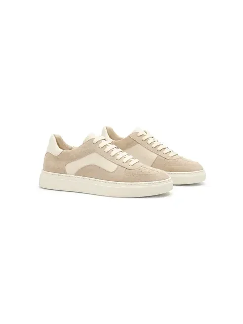
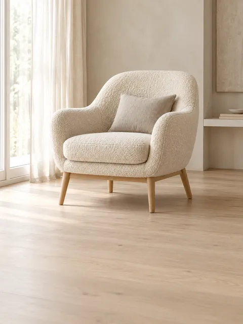
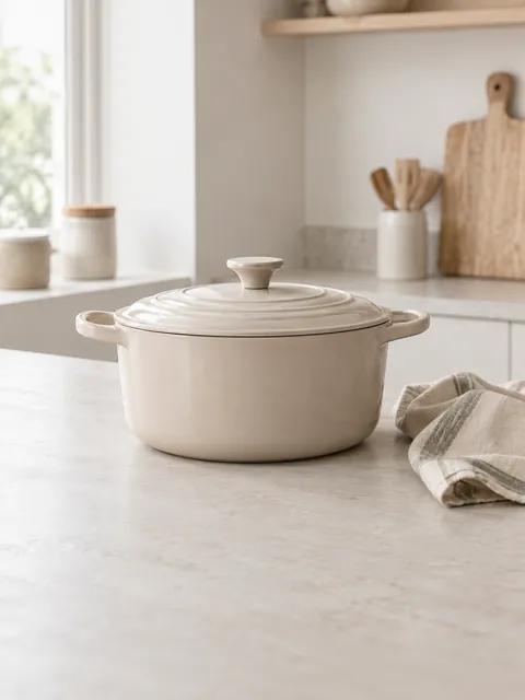
About these scenes
Pick one scene for the whole collection and run every product through it. Sun and shadows, In the kitchen and Room setting suit home goods; White background main image suits any grid.
Collection checklist
01
Pick one ratio before you shoot
3:4 portrait or square. Change it in the theme only once.
02
One scene per collection
Mixing a sunlit ledge with a dark studio looks accidental in a grid.
03
White first, scene second
Many themes show the second image on hover: put the scene there.
04
Same distance from every product
Small and large products should still fill the frame about equally.
05
Name files and alt text
tote-natural-canvas.jpg beats IMG_2041.jpg for search.
Questions
What makes Shopify product photos look professional?
Consistency more than gear: the same aspect ratio, background and light for every product in a collection, and a sharp image of at least 2,048 px on square photos.
What size should Shopify product images be?
Shopify says 2,048 × 2,048 px usually displays best for square images. See the Shopify image sizes guide for the full limits.
Can I get one look from photos taken in different rooms?
Yes. Run every snapshot through the same scene. The tote, planter and cushion above were shot in three places and share one sunlit ledge.
Should the first image be on white?
For most stores, yes: white keeps the grid calm and makes colors easy to compare. Put the scene second, where many themes show it on hover.
Do I need alt text on product images?
Add it. Shopify lets you set alt text on each product image; it helps shoppers using screen readers and gives search engines a description.